[ad_1]
Is the Nothing Phone 2a really worth the hype? Here’s what the Nothing Phone 2a offers to its users.

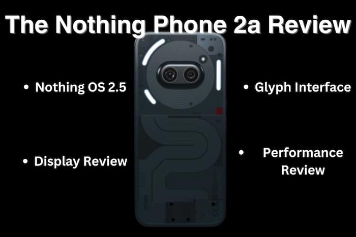
New Delhi: Nothing Phone 2a made its debut in the Indian smartphone market on March 5, 2024 in India at an entry mid-level segment. The MediaTek 7200 Dimensity Pro powered smartphone makes its mark with minimalistic design and user interface. The Nothing Phone 2a features a 6.7-inch 120Hz OLED display, and comes in two configurations to choose from 8GB or 12GB of RAM, and 128GB or 256GB of storage, both priced at Rs 23,999 and Rs 25,999 respectively. Additionally, the smartphone has its 50MP dual rear camera setup and a 32MP front camera, along with a 5000mAh battery supporting proprietary fast charging.
Here is are 7 reasons to buy the Nothing Phone 2a, (and few where it could improve)
Nothing Phone 2a Review:
Nothing OS 2.5
As soon as the phone boots up for the first time, the dotted retro interface makes the handheld device instantly cool, with its unique live widgets, minimalistic designs, a revamped status bar, and, of course, icons in the same fashion. The Nothing OS keeps up to its promise of delivering on a clean, minimalist interface that focuses on simplicity and functionality. But there’s more!

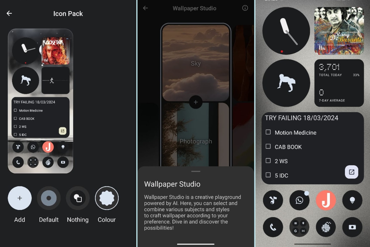
The Nothing OS 2.5 offering: icon packs, AI wallpapers, live widgets, and more!
Icons: While users can choose to opt for either the (default) pure Android icons, or the Nothing icon pack, it also offers another set of “Colour” themed icons, that dynamically adapt to the wallpaper/theme colours. Users can also download their own sets of icon packs to apply as per their choice.
Wallpapers: Like many smartphone brands, the NothingOS too lets users choose from its existing wallpaper sets or pick photos from the gallery; however, with the new 2.5 update, it introduces new AI generated wallpapers for the Phone 2a. One can choose from different combinations such as Sky+Photograph, Still Life+Painting, and so on. (PS: Users can also pick Surprise me olets usersption if they want to try experimenting!)
Widgets & Icons: One of the main features that significantly make the Nothing OS minimalistic are its widgets and icons. The live widgets, their ability to be resized, and, of course, the intuitive UI, further add on to give a complete, smooth experience of the Nothing Phone 2a.
The Glyph Interface
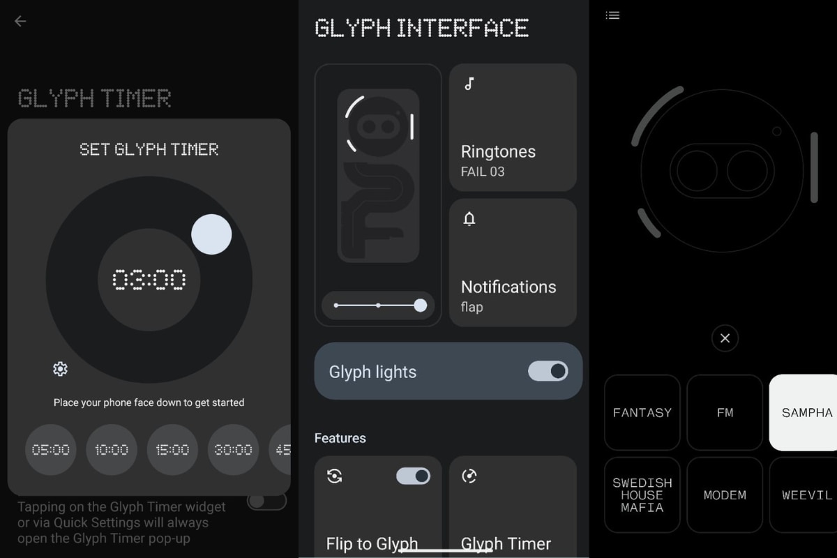
The Nothing Phone 2a offers three Glyph led lights, which come with plenty of features to explore. Be it the timers, ringtones, silent notifications, or bringing the dj lights in the the dull room, these lights make sure to steal one’s attention. The Glyph Timer lets you set your timers and get on with your work, without having to look at the screen, helping users (like me) to focus on other tasks while still keeping track of time. These lights display the real-time progress of timer at a glance, making it a cool and quirky feature of the Phone 2a. Few other features include Flip to Glyph and Glyph composer, letting you turn yourself into actual music composers for your ringtones!

The Glyph lights and their various features/ applications in Nothing Phone 2a.
Performance
While there aren’t any high end games, the Nothing Phone 2a could not perform thanks to its Dimensity 7200 Pro processor, the additional game mode and features such as increased responsiveness did give it an edge in the gaming sessions. The Phone 2a gives a smooth user experience with almost no need to switch up and use the Virtual RAM. Battery performance however, was not quite upto the mark. No, it didn’t drain at the blink of an eye, but given the charging speed and its usage, the battery numbers dropping were noticeable.
Display
The Nothing Phone 2a offers a smooth experience in both dynamic refresh rate as well as high refresh rate settings, given its 6.7-inch 120Hz flexible OLED display. The smartphone offers vibrant colours, and its 1300 nits peak brightness did prove to be helpful to read through the glare under direct sunlight.
What Could It Improve
The first thing that comes to the mind is the lack of adapter. Given the price, many fans must be anticipating the inclusion of a complete charger set rather than spending extra bucks for the same. Another feature which the NothingOS could include would be to limit charging after a threshold to extend the battery life of the Nothing Phone 2a. While the battery performance did not really stand out, a charging animation using the Glyph lights was desperately missed. As one continues to use the Nothing Phone 2a over time, it is evident, how the screen as well as back cover are easy to sustain thumb or finger impressions, which take away points from the design element of the newly launched smartphone.
The Nothing Phone 2a does offer a unique experience and that too at an mid entry level segment. For those on a budget and want to experience a clean minimalistic design, the phone does prove to be a decent choice after all.
[ad_2]